
The Meaning Behind Our Logo
As with our work, our logo has deep meaning and symbolism. It has been designed around our mission, vision, values, and intentions and reminds us that there is unity in our diversity.
The eye-like resemblance serves as a reminder that our work is being watched over and protected, but it also reminds us to reflect and ensure that our work is consistently guided by intention, strategy, and science.

Our logo's design reflects the modesty inherent in our brand and the profound intentions driving our mission.
The Rings
Each of the seven rings, seeds, and the centre circle in our logo represent a different area for The Dandelion Philosophy.
The intentional imperfections in their design serve as a reminder of the beauty found within our imperfections.
Colour psychology also enhances the meaning behind each focus area, adding depth to our intentions.
White
White represents possibility. This blank canvas is our opportunity to create something innovative and new.

Yellow
Yellow — the colour of energy, vitality, and light. The vibrant yellow ring in our logo symbolises nutrition and nourishment, reflecting our commitment to combating hunger and malnutrition while striving to establish food security in the communities we serve.

Red
Red is a high-energy colour and symbolises inspiration, passion, courage, and reflection. This colour represents our passion for reflection, learning from the past, and the courage it takes to move forward.

Purple
Purple represents a higher frequency, spirituality, and quality. The deep hue of purple serves as our healing band, symbolising both the psychosocial support work we do to heal past traumas and our restoration efforts.

Blue
The colour blue represents trust and confidence, and in the context of our work, it symbolises education.
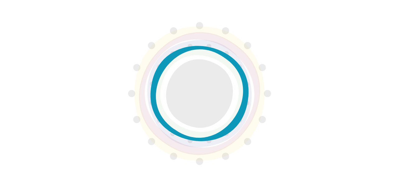
Green
Green is the colour of nature, balance, and growth. It represents our farming and agriculture work and our commitment to sustainable development, regenerative agriculture, and personal growth and development.

Charcoal/Grey
The charcoal/grey tones featured in our "seeds" and the centre circle of our logo represent efficiency, intention, the power of community, and humanity. Each perfectly imperfect ring surrounds and protects the core of all our work and the essence of our existence — ”Ubuntu”, the principle of "Humanity to Others".
The Number Seven
The seven rings in our logo represent the days of the week.
The number seven holds symbolic importance in numerous contexts:
Seven loaves, signifying abundance
Seven steps taken by Buddha at birth
The seven ancient wonders of the world
The division of the world into seven regions
It represents both physical and spiritual completeness
In the Rigveda, the number seven embodies "the seeker".
The number seven also features prominently in folk sayings. It’s often said that breaking a mirror leads to seven years of bad luck.
In Iran, a cat has seven lives, not the nine of Western myth.
In China, seven represents the stages of female life: a girl gets her “milk teeth” at seven months, loses them at seven years, reaches puberty at 2×7=14 years, and reaches menopause at 7×7=49 years.
In ancient Egypt, there were seven paths to heaven and seven heavenly cows.
The Seeds
Sixteen seeds surround the seven rings of our logo.
Number 16 generally represents introspection, intuition, wisdom, independence, and family.
The Myers–Briggs Type Indicator (MBTI) references 16 personality types in psychology.
Further, the number 16 in numerology represents letting go of trauma and negativity and seeking collective wisdom.
Our logo features two rings of 16 seeds each.
The 16 inner seeds represent our elders, our leadership, and the vision for our work.

The 16 outer seeds in our logo represent the wisdom of the ancestors, who watch over our work and remind us of those who have made sacrifices for our futures.

Our Global Board, Strategic Advisory Board, Council of Elders, and Leadership Team also each have 16 seats.
The Centre Circle
The centre circle in our logo symbolises humanity, oneness, and the people we serve. It is the heart of our work and the gathering place for transformation.

This circle also represents our carefully selected Practitioners of Purpose™ — volunteers, partners, communities, and donors — who make our work possible.
Our Name
Finally, our name, The Dandelion Philosophy, is a constant in uncertain times. It is built on the principle that, like the seeds of a dandelion blowing in the breeze, kindness nurtures and inspires more kindness.
Our name is based on the principle that "one act of kindness inspires many, and many create change." This is our philosophy, distinct from existing ways of thinking.
We aim to spread transformation, hope, and empowerment, beginning with seeds of kindness. As our movement grows, more people will sow these seeds, ultimately filling the world with a movement rooted in humanity.

Essentially, our logo embodies The Dandelion Philosophy's beliefs and aspirations. Each element, carefully designed and filled with symbolism, expresses our mission, vision, and values.
Reflecting on the symbolism of our logo, we are reminded of our ancestors' wisdom, our elders' leadership, and the collective vision that drives our work forward.
Our commitment to humanity, unity, and transformative change is at the heart of it all.
By embracing our logo, we embrace our mission: to create a world where every individual thrives.
Our logo is a source of hope and inspiration, guiding us towards a brighter future for all.

To learn more about The Dandelion Philosophy visit www.dandelionphilsophy.com.